Made Fresh: Aligning Visuals
Happy Thursday! This week we’re learning FOUR ways of aligning visuals in your reports on How To Use Power BI!
This week: Aligning Visuals
We’re talking about Alignment this week… making sure the visuals in your report are all lined up. Your reports will look more organized and professional when the visuals in them are properly aligned.
I go over FOUR ways of aligning visuals in this post. Some are more specific (to the pixel) than others, but come with their own issues.
I even go over an alignment tool that Power BI theoretically has but has NEVER worked for me (nor have I seen it work for other people). So frustrating.
Check it out, and let me know if you have alignment issues (in Power BI). There are a TON of nuances/issues with alignment, and I think I may have run into all of them.
Next Week: Getting our DAX on with SUM
We’re getting into some basic DAX on How To Use Power BI.
DAX (short for Data Analysis Expressions) can be a little scary, and with good reason. This language for doing calculations in Power BI *can* be very complicated and obtuse and sometimes you need to do some mental shifts to understand how DAX works….
BUT, you know me… I’m all about making all this stuff EASY, and it’s totally possible to learn and use DAX. We’re going to start with all the easy stuff to get you comfortable with DAX.
Cool? Cool!
Next week we’re exploring the SUM function. It’s gonna be SUM fun, y’all. ;)
People-Friendly Power BI
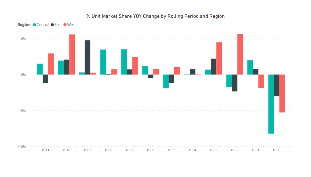
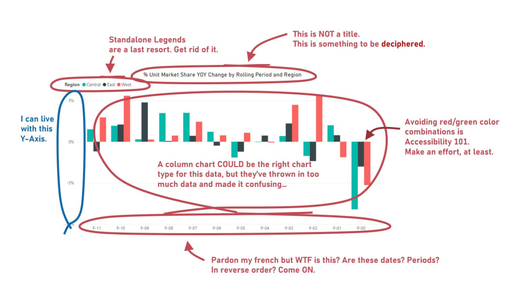
On my monthly blog about how to make Power BI more user friendly, I’ve taken a chart provided by Microsoft as a “showcase” of what Power BI can do and done a makeover (actually 3 makeovers) on it.
It’s a simple column chart, but it’s also horrible. Almost everything about it could be better and more user-friendly.
I have a LOT of opinions about how Power BI charts things by default (and how most Power BI developers visualize data), so this post is one where I show I’m not just all talk.
I tear the Microsoft chart down and apart and re-build it in Power BI in THREE different ways that communicates the key information in the data better.
If you’re not subscribed already (a lot of you are!) you can do that here:
Take care everyone,
Joe.
Like these posts but need more formal (but still engaging and fun) training in Power BI? Or maybe there’s an issue that you need some Power BI support with…
Contact me, Joe Travers, at Travers Data or at joe@traversdata.com. I got you.


