


How to Format a Bar Chart
How to Format a Bar Chart
Post Tags: Charts | Bar Charts | Formatting | See all tags
This post is part of the Bar Chart series:

This post is about how to implement basic formatting in a bar chart in Power BI.
This post was made with the December 2023 version of Power BI desktop. While Microsoft updates Power BI Desktop every month, the specifics of building and formatting charts doesn’t change hardly at all. If it does, I’ll update this video and write-up.
Okay, when I say formatting BASICS, I mean what you should do EVERY time you build a bar chart to make it as easy for your users to understand.
For this post we’re going to start with the Power BI file from the “How to Build A Bar Chart” post. It already has a simple Bar Chart made, and we’re going to format it.
You can download a copy of the .pbix file by clicking here.

The data the Power BI file connects to is the same data as is used in the How to build a Bar Chart tutorial. If you want your own copy of it, you can download it here:
Here’s the video version of this post. Below the video are written instructions.
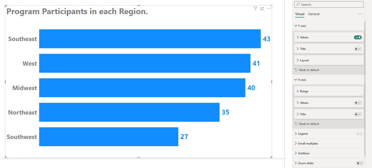
Here’s the bar chart we’re going to work with. It’s what Power BI gives us when we give a bar chart visual something to count (Participants) on the X-Axis and something to split our count up into categories (Regions) on our Y-Axis.
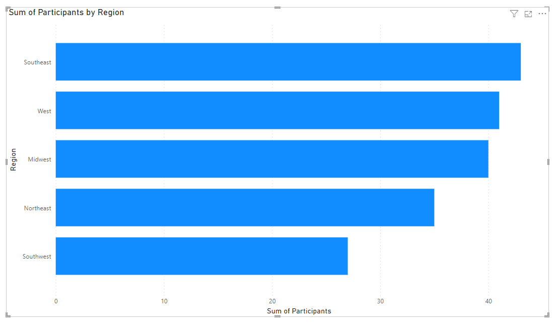
It’s functional, but it can be SO much better, and we can make it better with some simple formatting tweaks.
1. A good title that expresses what your chart is about
The first thing we need to format here is our title, so we can be really clear to our viewers what our bar chart is about. The title is the most important part of any chart (yup, even more important that those bars). You want to have a descriptive title that describes what your chart is about and ideally what the main key takeaway is.
This way, even if your chart is hard to understand (but let’s make sure it isn’t!) your viewers will still get the point.
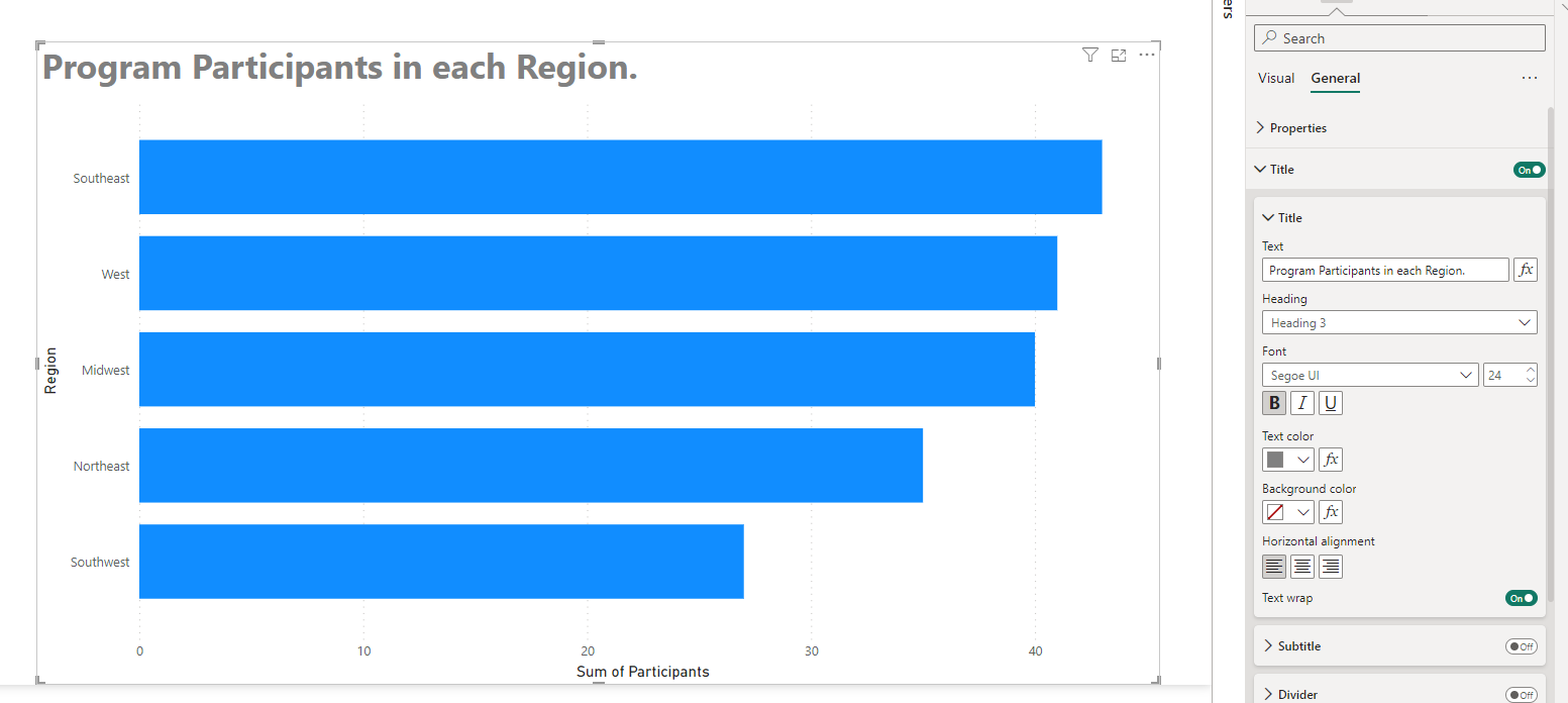
Delete the awful default title Power BI gave the chart and write out a better one that describes your data. Make it bigger and more visible. People need to see it. Always left align your title and keep it at the top. Our brains and eyes in the western world are programmed to start reading content at the upper-left.
We adjust our title by making sure our bar chart is selected and then going into the Formatting options in our Visualization Pane. In there, we’ll go into the General section and open up the Title section. We can type in our new title there, using regular language. We can use “Number of Program Participants in each Region.” We can increase our title font and color here as well.
2. Data Labels!
Next we’re going to format how our users figure out the size of our bars. By default, Power BI gives us an x-axis with values, and faint gridlines that give our viewers a little bit of help estimating how large each of our bars is.
While this may work for some bar charts, namely those where you just want to show that some categories of data are larger than others (with no one caring about *exact* values), most of the time, if you’re comparing categories of data (which is what bar and column charts are amazing at showing), viewers will also probably want to know the *exact* size of the bars so they can easily figure out the differences between them.
Add value labels by turning on the Data Labels on/off switch in your Formatting options. You can also increase the label font size and make the data label font the same color as our bars.
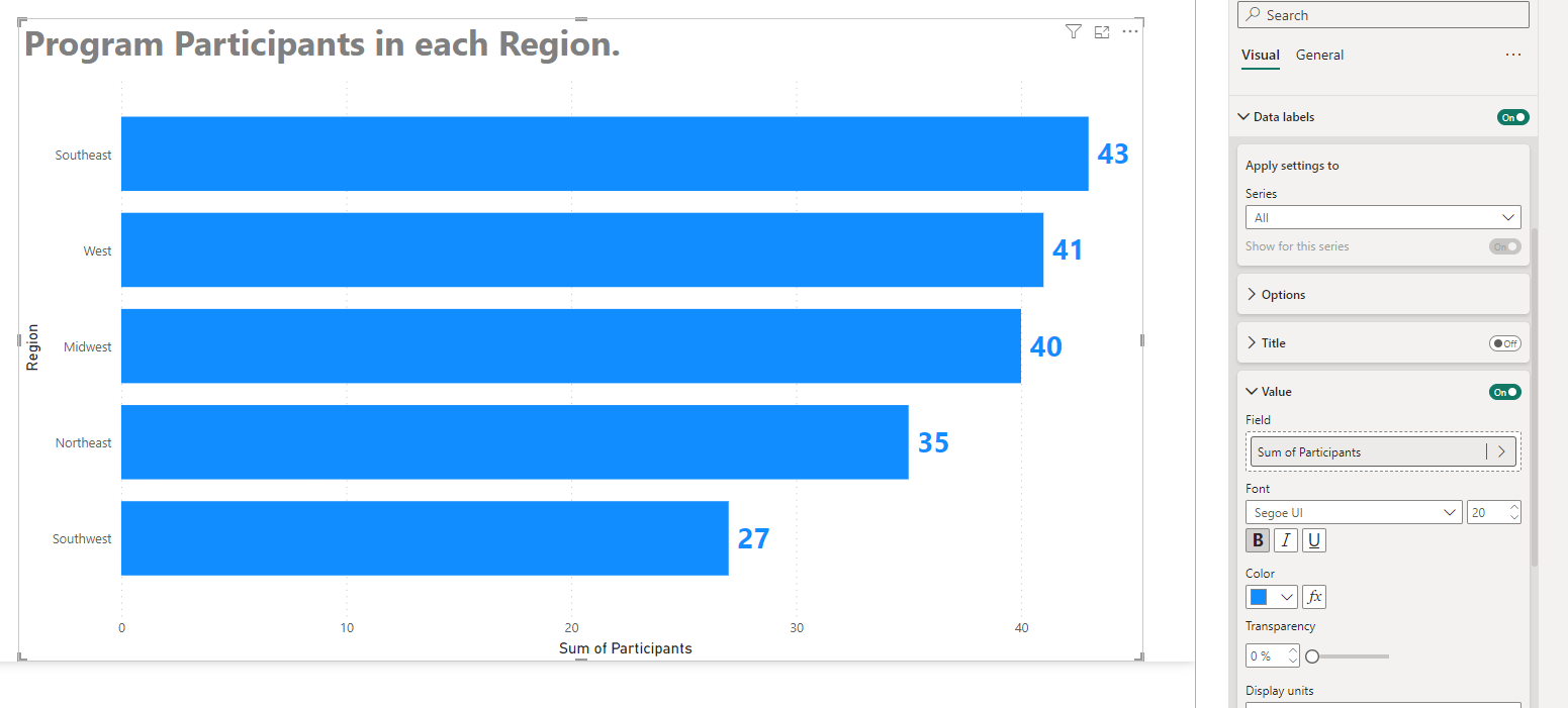
We can also increase the font on your Y-axis so those data categories (our Regions) can be seen easily.
3. De-Clutter!
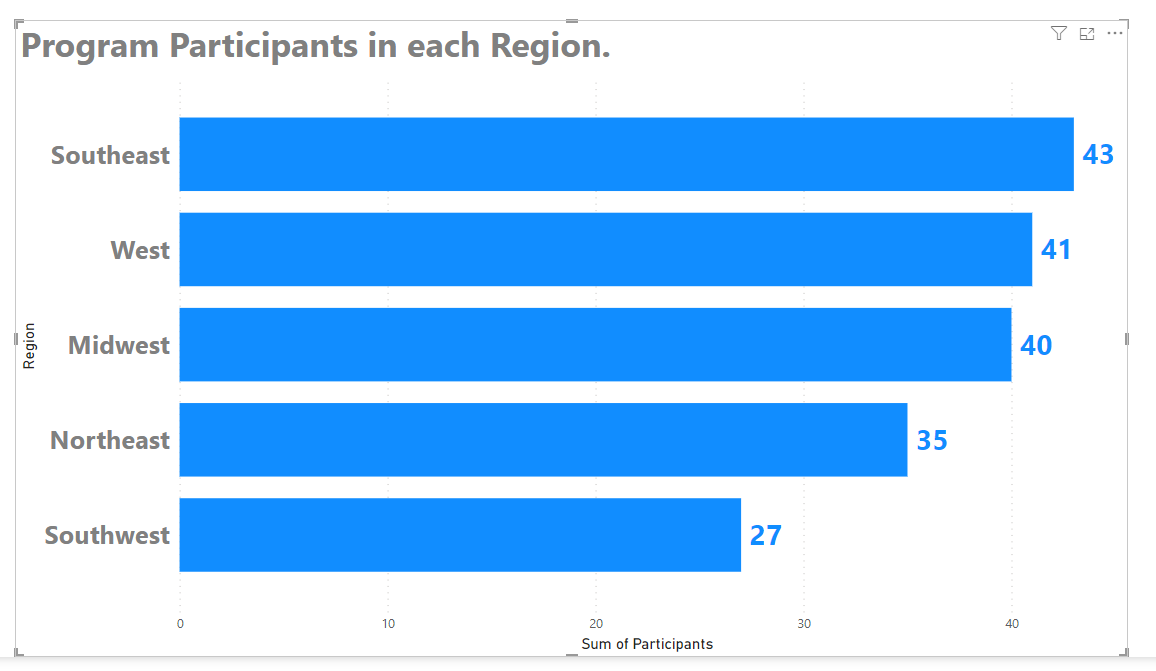
You’ve probably heard of “Chart Clutter” and clutter are the elements on this chart that don’t add anything to the message we’re trying to communicate. In addition getting rid of our axes titles, we can also remove the x-axis itself. We don’t need the x-axis labels anymore, as our bars are labelled directly.
To turn off axes values and titles, there are on/off switches for each in the X Axis and Y Axis formatting sections.
Now we know 3 essential ways to make your Power BI bar charts not only better, but *easier* for your Power BI report users.
Comment below if you have questions about Bar Chart formatting.
Take care,
Joe.
This post is part of the Bar Chart series:
Post Tags: Charts | Bar Charts | Formatting | See all tags