How to format a Pie Chart
Like these posts but need more formal (but still engaging and fun) training in Power BI? Contact me, Joe Travers, at Travers Data or at joe@traversdata.com.
In this post we’re going to learn how to format Pie Charts.
I highly recommend that before learning from this post you watch/read the post about how to make a Pie Chart, which goes over how NOT to make them as well. Pie Charts are your best chart option in very specific circumstances.
This post is about how to format them to make them user-friendly once you’ve made them.
We’re going to use a Power BI file that has a pre-made Pie Chart. It’s the Pie Chart made in the How to make a Pie Chart post. If you’d like your own copy of the Power BI files, you can download it here:
Here’s the Excel data file that the report connects to as well. You don’t need to download it separately for what we’re doing in this post, but you can still download it so you have your own copy, if you’d like. That way, you can make your own Power BI file and connect it to your own copy of the Excel file.
Here’s the video version of this post. Below the video is written instructions.
Video Post:
Written Instructions:
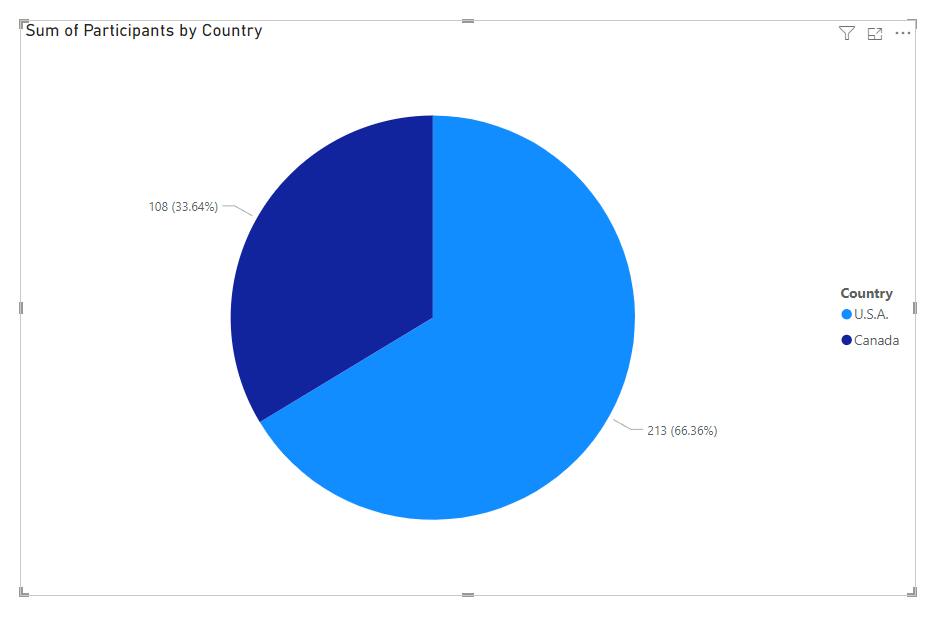
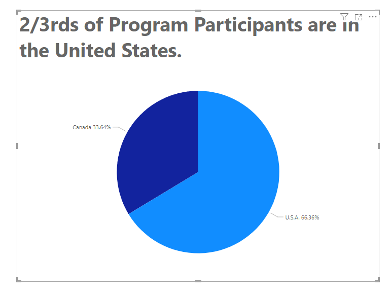
We’re starting off here with a Power BI file that already has a Pie Chart made, but it hasn’t been formatted yet, it’s just the bad default formatting that comes with Power BI.
You do NOT want to have a Pie Chart formatted like this in your Power BI report, so let’s learn how to clean it up.
A Better Title
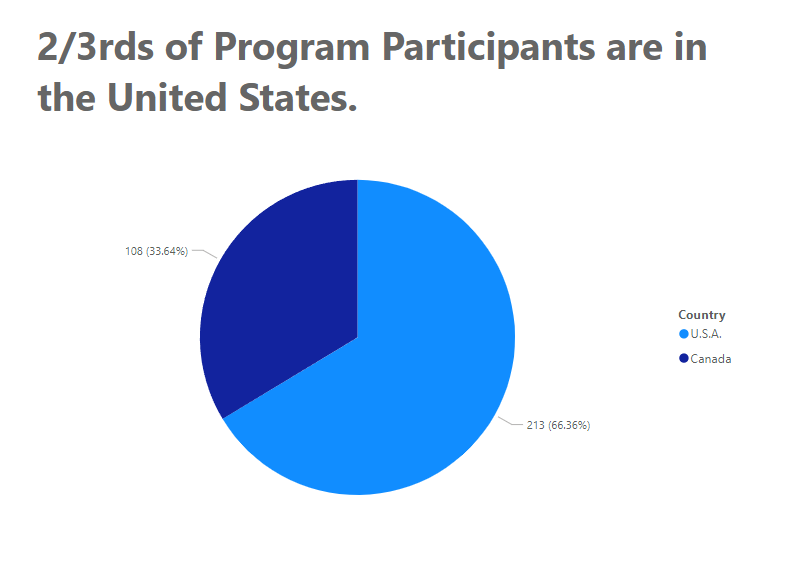
First off, and most importantly, we want to change out title to one that is descriptive, written in plain language, and written as a sentence. The purpose of a great title is to tell your viewers the key takeaway of the chart.
For this one, let’s use a title of:
2/3rds of Program Participants are in the United States.
With the Pie chart selected, go to the Formatting options in the Visualizations Pane, click into the General options, open up the Title Section and put in your new Title.
Embed the legend.
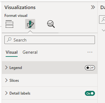
Next, we’re going to make our actual Pie a bit easier to understand by getting rid of our legend so that our viewers’ eyes aren’t bouncing back and forth from the visual to the legend. This is a bigger problem with charts with tons of category colors, but it still is happening here.
Instead of a legend, we’re going to embed our categories (our countries) right into the visual.
First, turn off the Legend by going into the Formatting options and clicking the Legend on/off switch to “Off”.
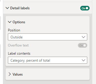
Then, we’ll open up the “Detail labels” section there in our formatting options.
This gives you some positioning and contents options.
We’ll leave our position as “Outside” and change our Label contents to “Category, percent of total”. That gives us our country names and percentages in our labels.
We’d also want to format these label values, so let’s open up the “Values” section of our label formatting.
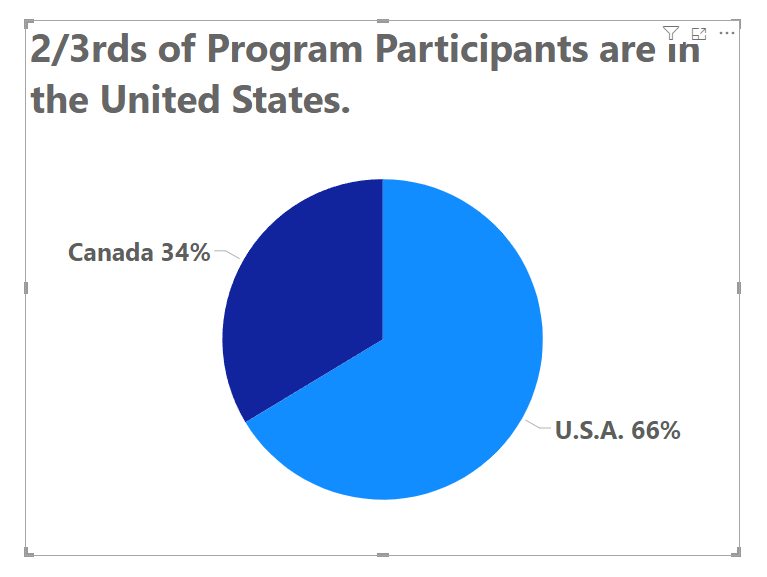
If we adjust the font so it’s larger, bold it, and tell Power BI that we don’t want any decimal places, we get labels that are much more visible.
One final thing we can do to our labels is color them so they match the colors of their pie slices.
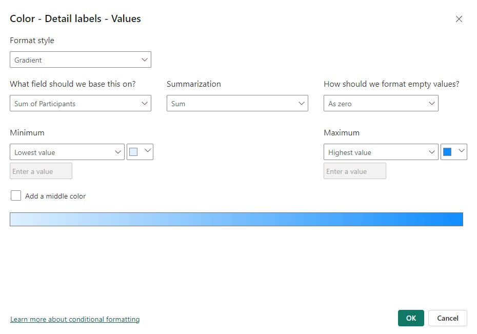
To do this, click the little “fx” button next to the color selector and it’ll pop up a color rules window:
This looks complicated but is easy once you know what it’s doing (and that’s what this post teaches!)
First, we want our Format Style dropdown selection to be “Rules” as we’re going to set some color rules.
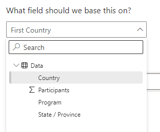
Then, we want to base our rules on our Country column, as the categories of data in our Pie are based on if the data is for the U.S. or Canada, so select Country for that dropdown.
Now we just have to program in what color should be for what country. The first rule is already started for us, just modify it so it looks for “U.S.A.” and puts in our blue color for the U.S., just like our Pie does.
We need another rule to cover Canada, so click that little box at the right that says “+ New rule” and do we’ll get a new row for another rule, that we can put our Canadian color in:
Then click the green OK button at the bottom.
We now get our Pie labels matching the colors of our Pie pieces!
That’s how to format a Pie Chart in Power BI. So much better now that the default formatting, am I right?
If you have questions about formatting a Pie Chart, ask in the comments below and we’ll figure it out together.
Take care everyone,
Joe.
Post Tags: Charts | Pie Charts | Formatting ] Free | View all Post Tags
This post was made with the April 2024 version of Power BI Desktop.


