How to make a Line Chart
Post Tags: Charts | Line Charts | View all Post Tags
This post was made with the February 2024 version of Power BI Desktop.
This post is all about how to make a line chart in Power BI.
We won’t get into too much detail about the many things we can do with line charts, but those will be their own posts. Today we’re talking about the basics of line chart creation.
We’re going to start off with a report that already has Excel data connected. If you need to learn how to connect data, go watch the Connecting to Excel Data post first.
If you’d like to use the same Power BI file I use in this post (a blank report with data connected), you can download it here.
Here is the data file that is connected to the report, if you want to download it and do this along with me.
Here’s the Video version of this post. Below the video is a written description.
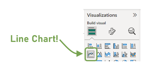
The first thing we’ll do once our data is connected and loaded is to select the Line Chart visual from the Visualization Pane. It’s the one that looks like a Line Chart.
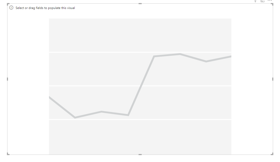
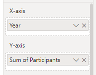
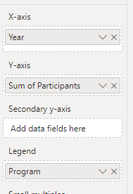
Line Charts are at there best when they are showing data over time, so we want the years in our Year column along the bottom of our chart, which is our X-Axis. We’ll drag our Year column from our Data Pane to the X-Axis box on our Visualization Pane.
Now we need something on our Y-Axis… something that we can count or sum or aggregate in some way and show it for each of our different years on our X-Axis.
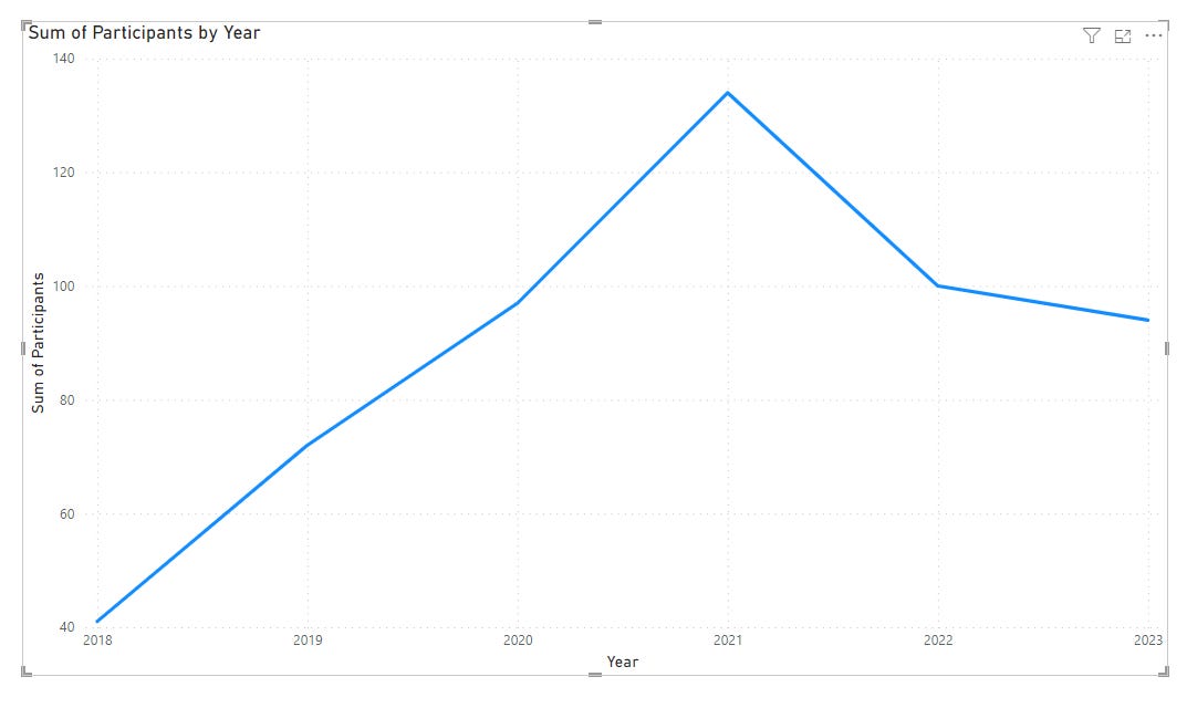
We want to see Participants over time, so we’ll bring our Participants field, which is a numeric field, to our Y-Axis.
Yeah! Line Chart!
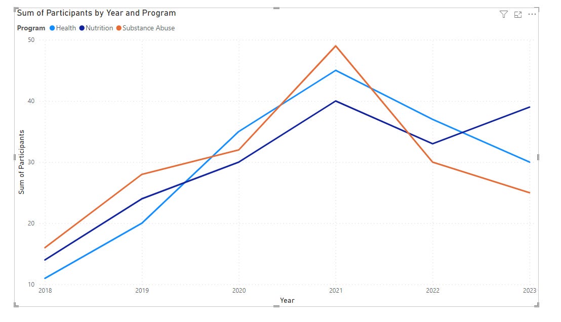
We have another field in our data and that’s for Program. Our participants were part of different programs, so if you want your line to be split up into different lines for different programs (because right now it’s one line with the sum of participants from ALL programs) you bring your Program field to your Legend box.
While this is a very popular way of making a line chart, it’s not the easiest to understand if we have more than 3 series of data (or 3 programs in our case). If a viewer was interested in seeing the number of participants in a certain program, they have to visually only pay attention to a certain color of line. It’s not the easiest for our viewers. It becomes a Hot Mess if there are tons of lines.
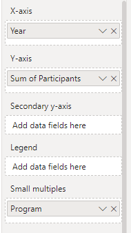
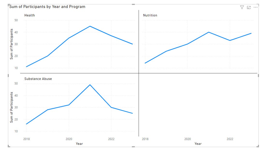
Instead, let’s use our Small Multiples box to split our data up to be a bit more user-friendly. If we move our Program field from Legend to Small Multiples, our line chart splits into 3 line charts. One for our Health, one for Nutrition, and one for Substance abuse
It’s now easy to see what’s going on in each Program in terms of participant numbers. Each chart is smaller, but clearer.
That’s it. Those are the basics of Line Charts.
Let me know in the comments below if you have a question about building Line Charts.
Post Tags: Charts | Line Charts | View all Post Tags


