Power BI is an extremely powerful piece of software, so it’s especially disappointing when Microsoft bills it as “data visualization” software and completely fails on small (but essential) things that take Data Viz from existing to excellent.
This post explores one of these fails.
We’re going to use a simple Power BI file to get to know this fail. If you’d like to use the same file, you can download it here:
If you’d like to the data source file this .pbix file connects to, you can download it here:
Video Post:
Written Post:
Power BI has been around for 9 years since it was launched in July 2015, and it’s very powerful but STILL gets really basic data visualization formatting wrong.
It’s like knowing a 9 year old who learned how to eat with utensils years ago and most of the time they eat just fine… but when they eat certain kinds of food a large percentage gets into their nose instead of their mouth.
The basics are there… get food inside the face. The execution of the task fails sometimes though.
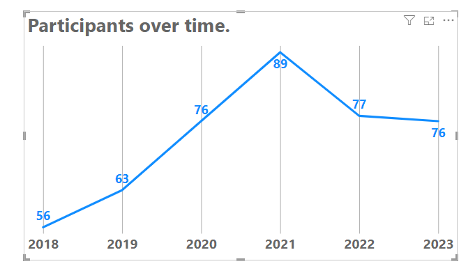
This example uses a line chart, and this line chart has labels turned on.
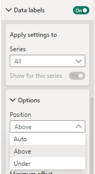
The labels look generally okay, but let’s take a scenario where we want to standardize where our labels appear in relation to our data points. If we want them to all appear ABOVE our data points, we go into our formatting options on our Visualizations Pane, open up our Data Label options and change the Position dropdown from “Auto” (which is always the default when Labels are turned on) to “Above”.
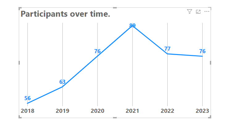
The label positioning is set to ABOVE, but the highest point in our Line Chart looks awful now. The label is put right on top of the data point.
Power BI, while smart in some things, is still pretty dumb when it comes to recognizing that sometimes label positions means a bit more room is needed on a chart canvas.
We need a bit more room at the top there.
We shouldn’t *have* to tell a 9-year old piece of software made by the world’s biggest software company that labels need a bit of room, but here we are.
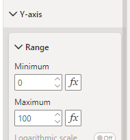
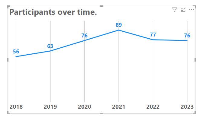
The simplest and easiest way to fix this is to adjust our Y-Axis minimum to give a bit more space to that top label. Let’s change it to 100. While we’re at it, let’s make our minimum on the Y-Axis 0.
Much better.
So, we shouldn’t have to do this with a 9-year old, but the next time you see it shoveling food into a nose hole, remind it that the mouth is where the food goes.
Have questions about making more room for labels? Let me know in the comments below.
Take care everyone,
Joe.
Post Tags: Line Charts | Labels | Fails | See all tags
Contact Joe | TraversData.com | People-Friendly Power BI | LinkedIn
This post was made with the June 2024 version of Power BI Desktop.


