Slicers
Post Tags: Slicers | Filters | View all Post Tags
Note: This post was made with the April 2024 version of Power BI Desktop.
Let’s learn about Slicers! Slicers are a LOT like Filters, but live right ON your Power BI report’s canvas so your report viewers can interact directly with them and decide how to slice and dice the data in the other visuals.
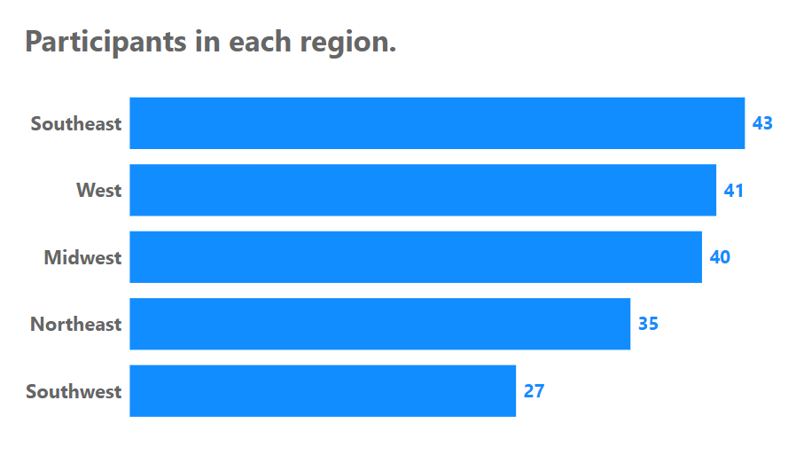
For this post (and the video below) we’re going to start with a simple pre-made Power BI file. It has some data connected and a Bar Chart already made.
You can download a copy of the .pbix file if you want to use the same chart I do in the below post (and video):
The data the Power BI file connects to is an Excel file, and if you want your own copy of that too (although you don’t need it to do what we do in this post), here it is:
Here’s the video. The written version follows the video.
Video:
Written Instructions:
We’re starting off with a simple Power BI report that has a bar chart pre-made (download the Power BI file for yourself above the video above).
While we have a post about the Filter Pane, the filter pane is mostly for us, the creators of a report. We use it to filter what data makes it from our Data columns (over there in the Data Pane) to the visuals on our report canvas.
Slicers, on the other hand, are actual report visuals that live right ON our report canvas so that our viewers can do their own filtering and seeing the charts and visuals on the page change. That’s what a dashboard is all about… telling a story but letting a viewer change the parameters and find new stories.
Let’s build a slicer together and learn the basics of how they work.
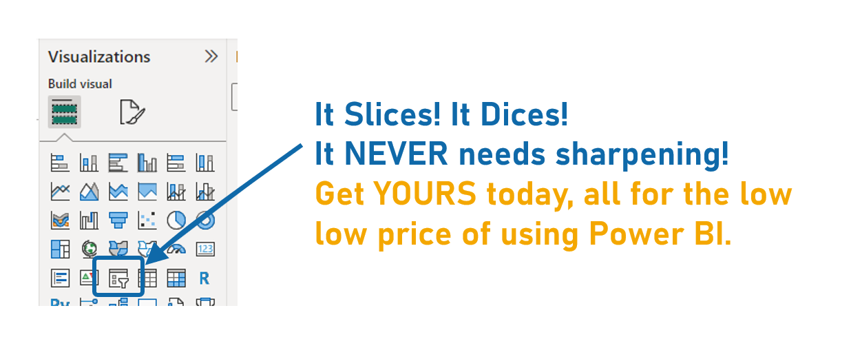
First, we’ll click the visual icon on our Visualizations Pane that has a little funnel on it. We want the one without a little lightning bolt on it.
The lightning bolt version is a new version that the Power BI team is still working on. Don’t worry, we’ll make a post all about that one too.
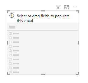
Once we click that Slicer icon, we get a little slicer place-holder box.
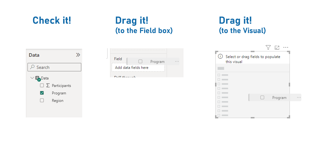
Just like it says, with the slicer selected (meaning we see that outline around it) we can check a data column in our Data Pane, or drag a column to the Field box on the Visualization Pane, or even just drag the column directly to this box on our canvas.
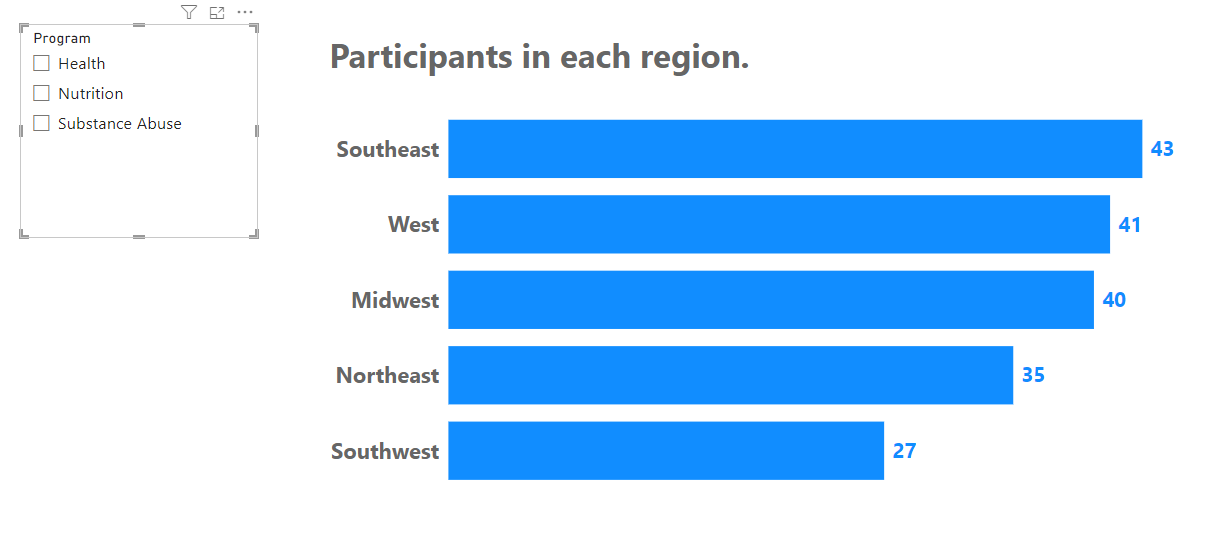
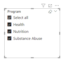
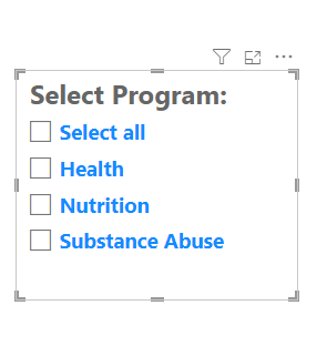
For this example, we’ve used the Program field in our data, and by default, Power BI gives us a Vertical List of Program options, with checkboxes.
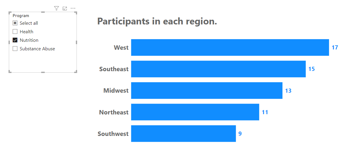
Selecting on of these options slices the data in our bar chart to only show data from that program.
Let’s look at the Formatting options for our Slicer by going into the Formatting options on the Visualization Pane.
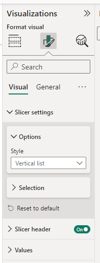
The first section is called “Slicer Settings” and lets us choose what kind of Slicer we want.
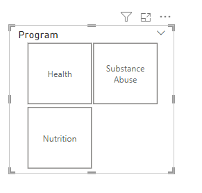
The default Slicer set up is Vertical List, but we can also select “Tile” which makes little boxes for us in our slicer:
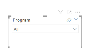
We can also choose Dropdown, which creates a dropdown menu of our Program options. This is a great space saver for reports. If you have a lot of options in a slicer, the dropdown option is the only one that doesn’t take up a lot of room.
I’ll switch this back to Vertical List so we can explore some of the other Formatting options a bit easier.
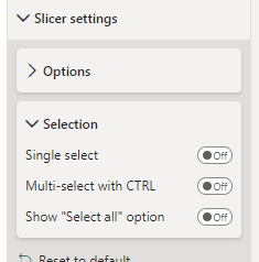
The next Formatting section is called “Selection” and controls how your viewers can interact with the Slicer. You can make it “Single-select”, so only one option can be selected.
When you turn “Single select” on, the other options disappear.
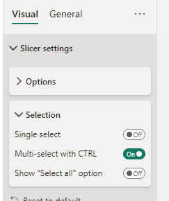
The next on/off switch is called “Multi-select with CTRL” and it’s on by default, for some reason. When it’s ON, your users have to press the CTRL key to select more than one option in your slicer. If you want them to be able to select multiple easily (without knowing the CTRL trick), turn this OFF.
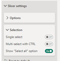
Next, there’s a ‘Show “Select all” option’ on/off switch that adds a “Select all” option to your Slicer:
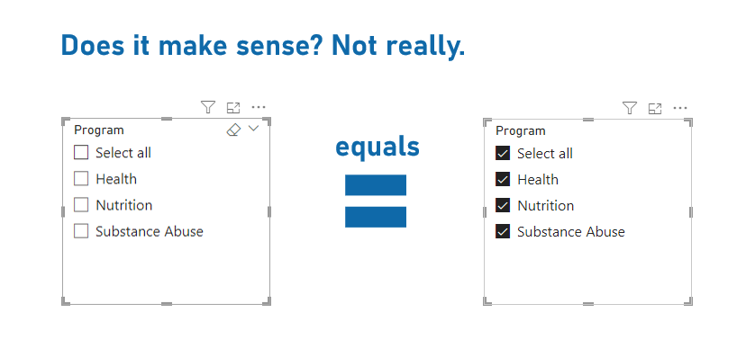
Now, speaking of “Select All”, an important thing to know is that when NOTHING is selected in a slicer, Power BI doesn’t slice your other visuals at all. Intuitively, you’d think that if NOTHING is selected, it means NOTHING should be populating visuals, but that’s not how Power BI is set up, unfortunately.
So, having nothing selected is the exact same as having everything selected. There’s currently no way around this.
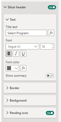
The last few options in Slicer Formatting is font and color formatting for both the Slicer Header (the title at the top of the slicer) and the Slicer values (our options).
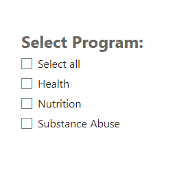
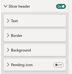
You can turn the Slicer Header on or off, and customize what it says and how it looks.
There are also options for adding borders and background colors to your Slicer header. There’s also a “Pending Icon” slicer that applies to an advanced trick to prevent a report changing constantly if a lot of slicer options are being applied. We’ll have a post just about that to explain how that works.
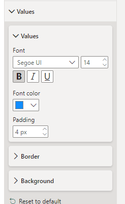
Finally, there’s a “Values” formatting section which lets you customize the font, font size, and font color in your slicers, as well as adding a border and background colors.
Finally, IF you have more than one slicer on your report page, they’ll interact with one another! In our case, if you also had a Slicer for Region, and one of the Programs had no participants in that region, that Region wouldn’t show up in the Region Slicer when that Program was being “sliced”.
That’s the basics of Slicers and their formatting options.
Let me know in the comments below if you have questions about Slicers and we’ll figure it out!
Take care,
Joe.
Post Tags: Slicers | Filters | Free | View all Post Tags


