What's New? How to add a Benchmark Line to a Bar Chart and SELECTEDVALUE
Hey, how’s it going?
Welcome to “What’s New” for this week on How To Use Power BI!
Benchmark Lines:
We have a new free post about how to add a Benchmark Line to your Bar Charts. Benchmark Lines (these are often also called Target or Goal Lines) give your report audience an immediate and easy reference point so they can see progress towards (or beyond) a goal!
Super easy and impactful, and quick to add. Win-win!
Add a Benchmark Line to a Bar Chart
Bar Chart Post Series:
The Benchmark Line post above is our 3rd post related to Bar Charts (so far), so I’ve made a “Post Series” post about Bar Chart posts, so that it’s easy to navigate through these posts for you and your friends and colleagues.
As I build out the content on How To Use Power BI, we’ll have many Post Series “guides” so that you can build your skills in any area with easy and quick posts and videos. It’s gonna be awesome.
Here’s our Bar Chart Post Series (so far):
New Visual Look:
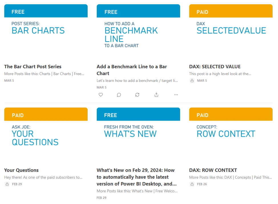
I’ve tweaked the visual look of the site a bit this week, to simplify the look but also make the distinction between free posts (blue theme) and paid posts (gold theme) really easy to determine. Here’s a glimpse of the main page to show you what I mean:
Free posts will always be free, and they’ll have all the basics you need to get started in Power BI.
Paid posts are about more advanced topics that come in handy once you have the basics down, or secret tips not a lot of people know about, or even things I’ve invented / hacked to make Power BI do things it wasn’t designed for.
DAX: SELECTEDVALUE
A new paid post hit the site this week and it’s all about the SELECTEDVALUE function. While pretty easy to code and implement, I’ve used SELECTEDVALUE (in cooperation with other DAX) to do wild things in reports. From making rules about what visuals show up based on user choices to altering the visual look of a report itself, it can all be done using SELECTEDVALUE.
This post is the basic function, but we’ll explore how to have fun with it as time goes on.
DAX: SELECTEDVALUE
Coming Soon to How To Use Power BI:
Next week we’ll have (at least) 2 new posts going live!
The free post will be an introduction to Power Query Editor, the extremely powerful part of Power BI that you can use to do just about anything regarding data transforming and how Power BI reads your data source.
This will be the first of MANY Power Query posts, so stay tuned. :)
The paid post next week actually comes from a question I received last week about adding a static vertical line to a Line Chart.
It’s easy to add a horizontal line to a Line Chart, but there’s no built in functionality to add a vertical line. Sometimes you want a vertical line to denote when something happened (like the implementation of a program, a new process starting, a pandemic happening, etc).
This post is about a fun little hack I created to not only make adding a vertical line possible, but EASY. :)
Take care,
Joe.


