How to add Series Labels to a Line Chart
Series Labels are an option on Line and Area charts and allows you to get rid of your Legend. Why would you want to get rid of your legend? We’ll cover that too!
We’re going to use a Power BI report with a pre-built Line Chart on it. If you’d like your own copy of this Power BI file, here you go:
If you’d also like the Excel spreadsheet the above Power BI file is connecting to, you can download it below, and connect your a blank report to it. Or, use the above Power BI file and just swap out the data source. Easy peasy. :)
Here’s the Video version of this post, followed by a written version.
Video:
Written Instructions:
We’re starting off with a Power BI report with a Line Chart already made (you can get your own copy of it above). There are also posts about making and formatting Line Charts. Go check them out if you need to.
This Line Chart has a Legend up there at the top, and we want to get rid of it.
We want to get rid of it because it causes “eye bounce” (that isn’t the scientific name for it). Our eyes (and the eyes of our chart viewers) bounce from the legend to the lines to decipher, over and over, which data series they are looking at.
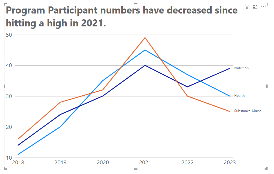
We’re going to eliminate “eye bounce” by getting rid of our legend and adding Series Labels, where our lines are directly labeled.
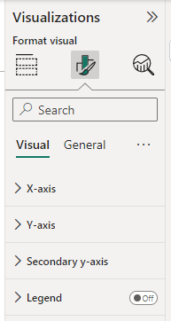
First, select the Line Chart and find the Legend section in the Formatting part of the Visualizations Pane. Turn that on/off switch to OFF.
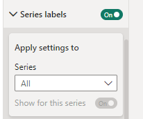
Now, we’re going to go down to the bottom of the Formatting options and find the on/off switch for “Series labels”. Turn it ON.
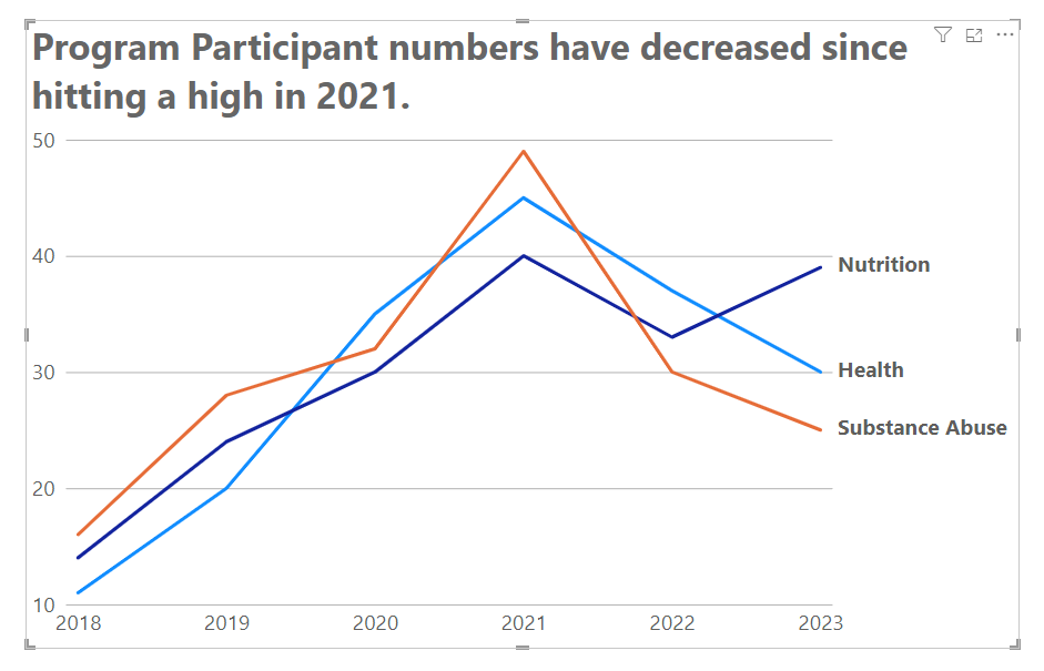
Now we have Series labels next to our Lines! So much easier associating a line with a series now, right?
We’ll format these labels up a bit to make them even more useful.
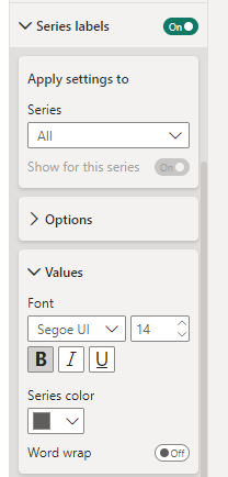
First, open up the Series label section we just turned ON. Make sure “All” is selected in the Series dropdown.
Then, go into the Values section. We can adjust the font size here. I’m going to increase it up to 14 here, and make them bold.
We’re not done yet.
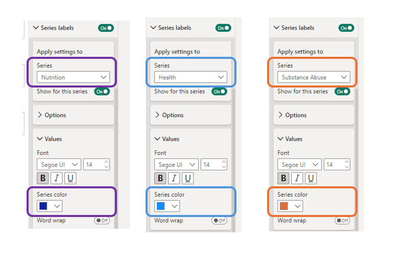
Remember that Series dropdown? We can select each series in turn and set our label colors to match the colors of our line.
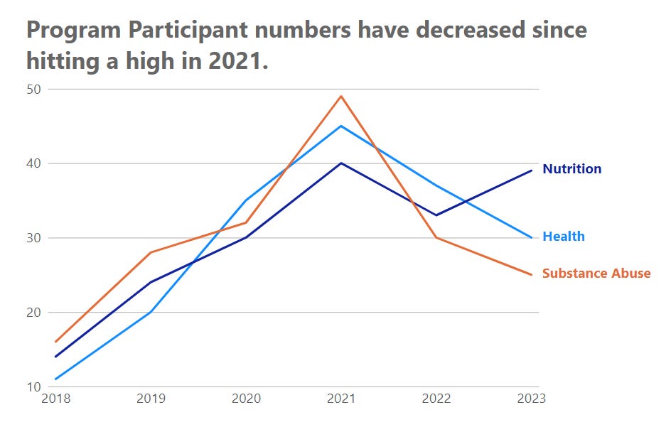
Now it’s REALLY easy to associate a Series of data with a color!
That’s all there is to it!
Your report users will LOVE you for this. It makes reading and deciphering charts SO much easier!
Comment below if you have a question. We’ll figure it out!
Take care,
Joe.
Post Tags: Line Charts | Labels | View all Post Tags
This post is part of the Line Chart Post Series.
Contact Joe | TraversData.com | People-Friendly Power BI | LinkedIn
This post was made with the May 2024 version of Power BI Desktop.


